Transform your business from the inside out.
At Chai Gate, we blend dialogue and data to clarify what matters most—the value of your offerings, the needs of your stakeholders, and the market fundamentals that drive long-term growth.
Then we unlock those opportunities together through stories, systems, and design—creating lasting value for you by accounting for everyone.


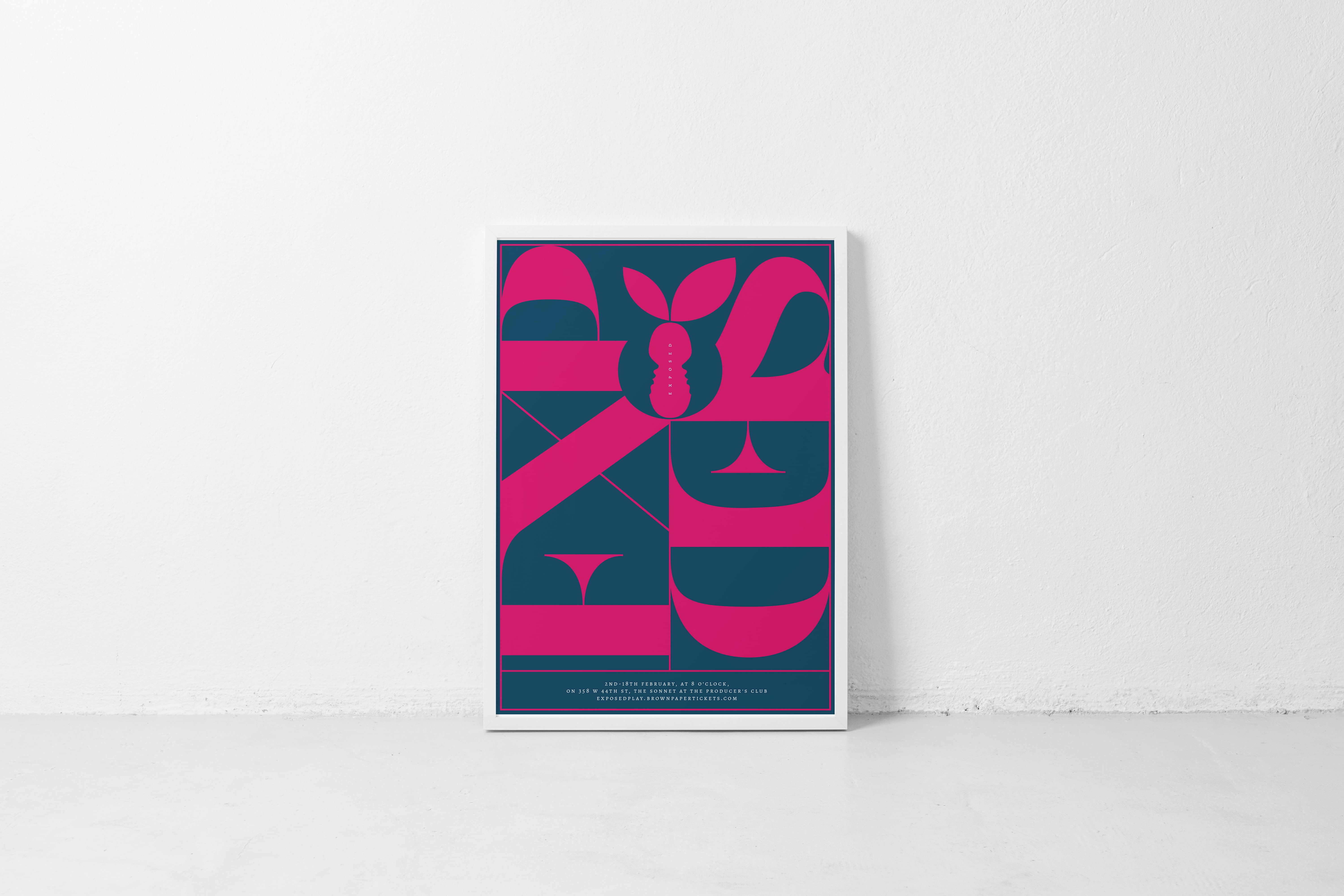
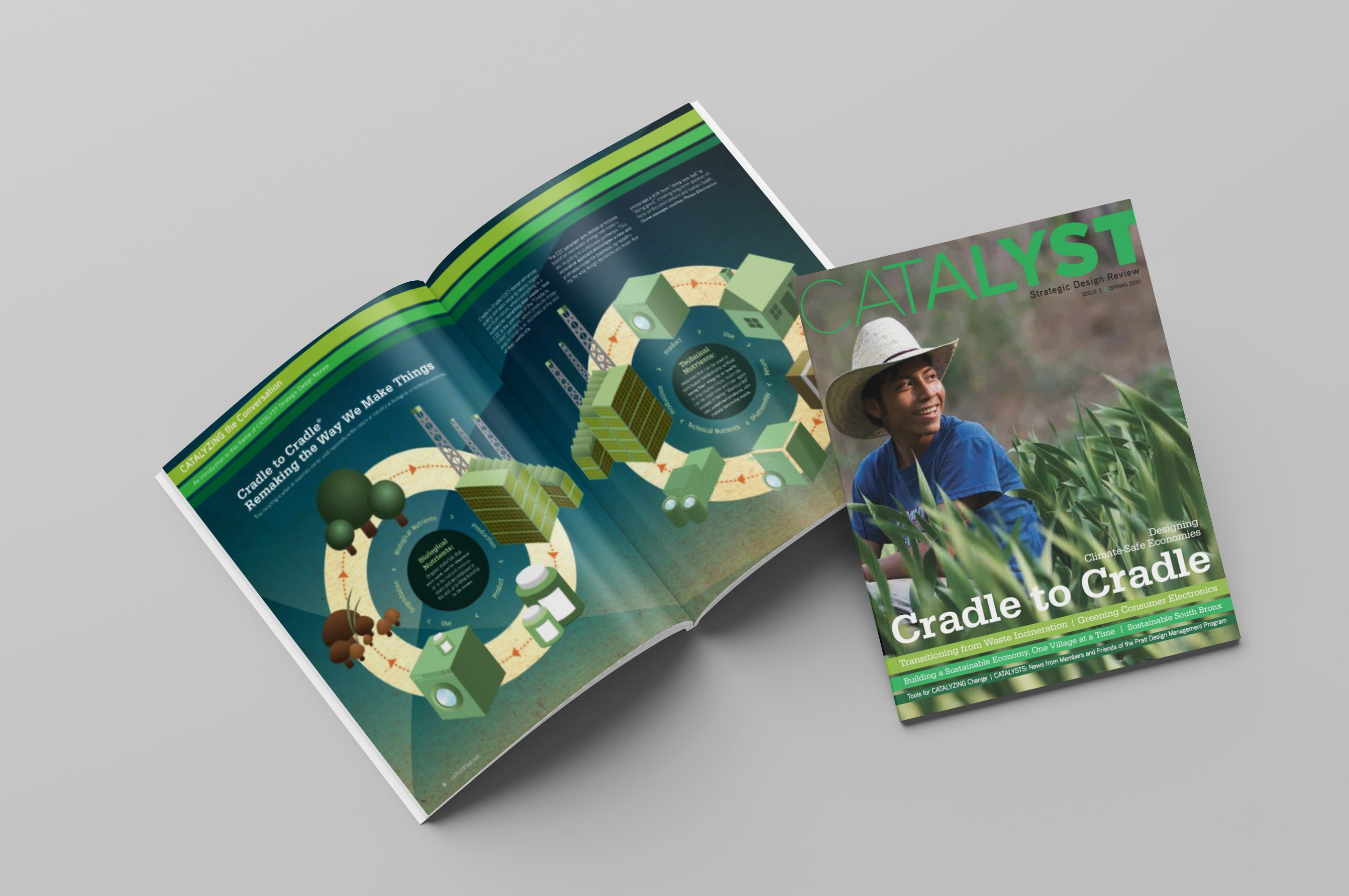
Exposed
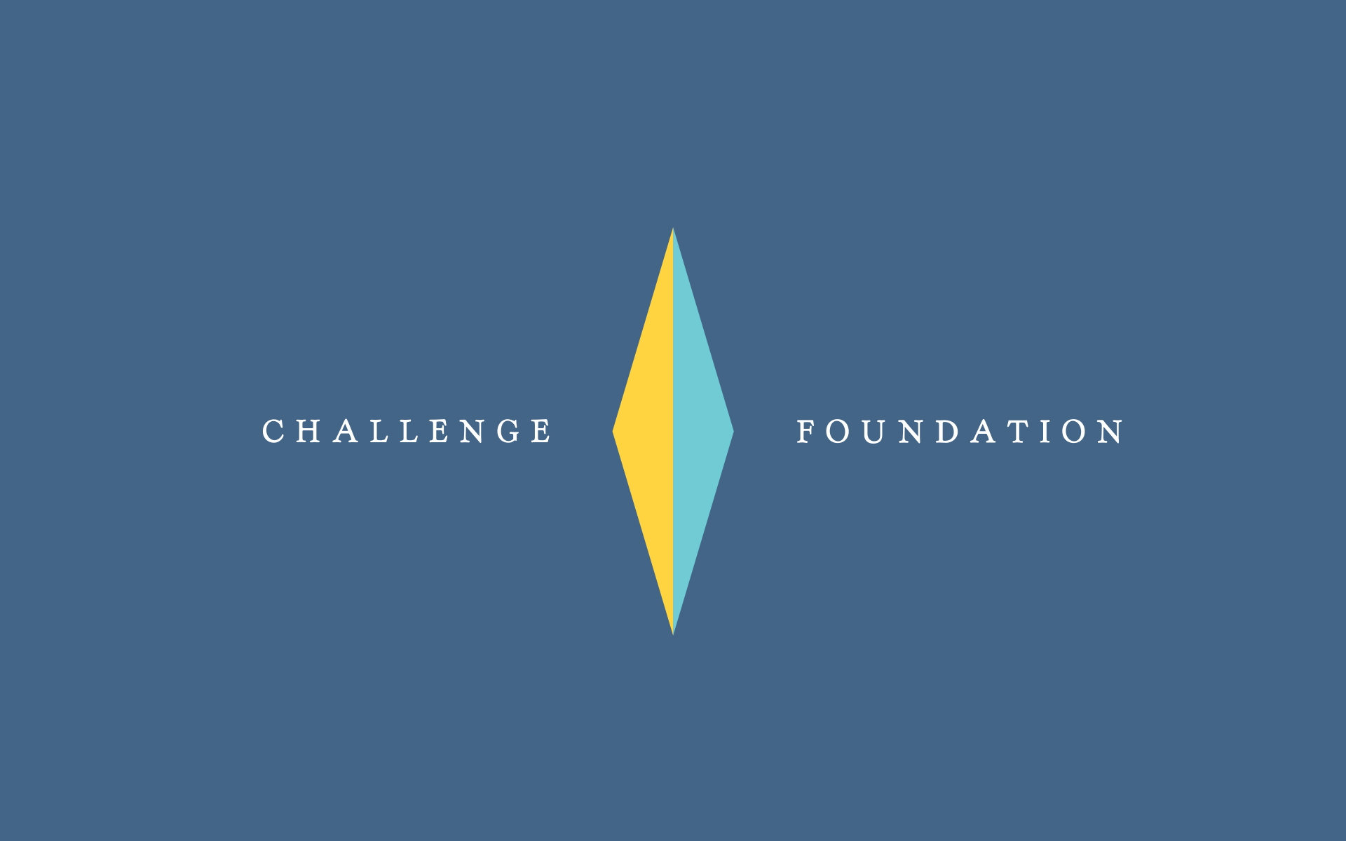
Theater Identity Design / Visual Communication / Art Direction
New York City, NY
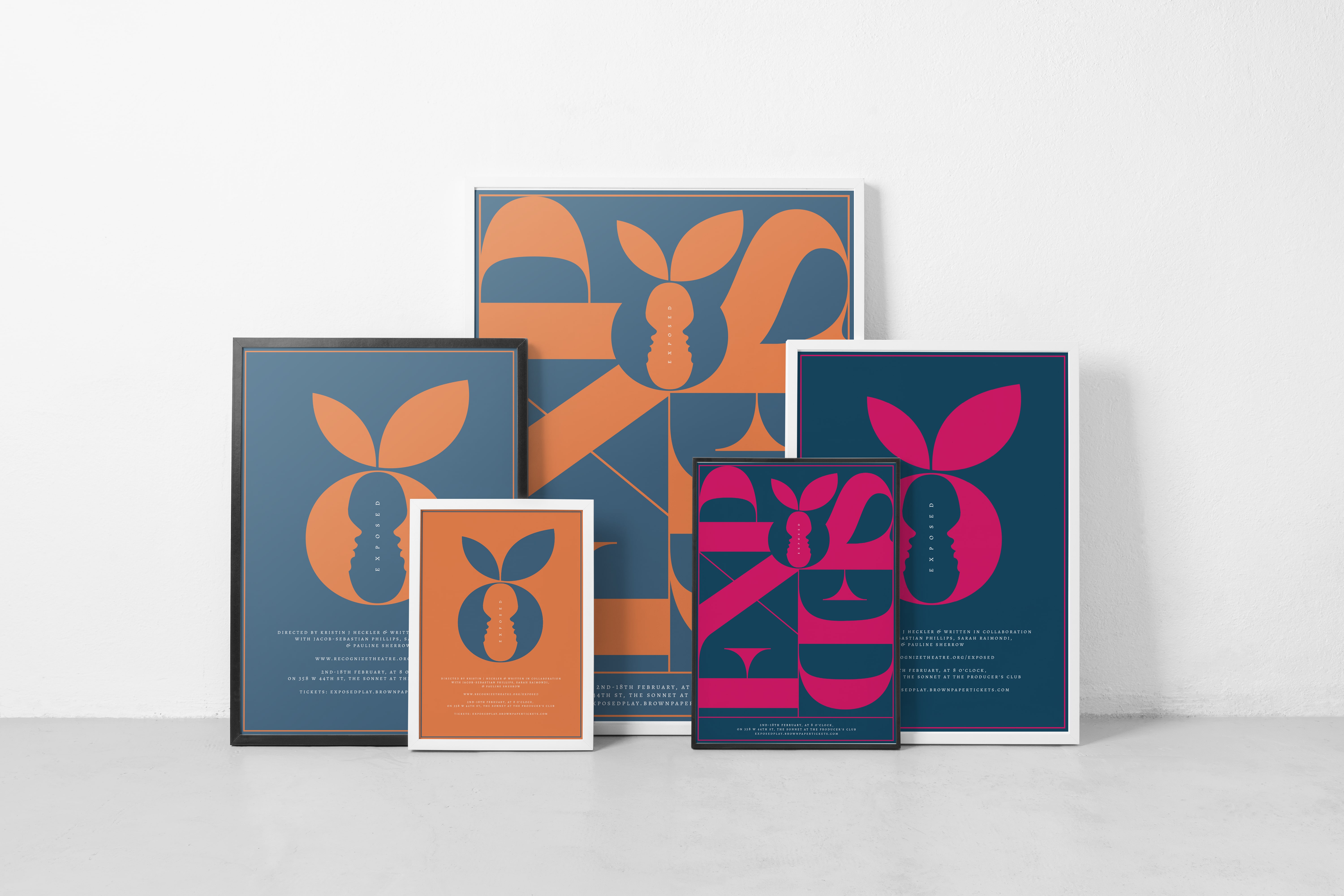
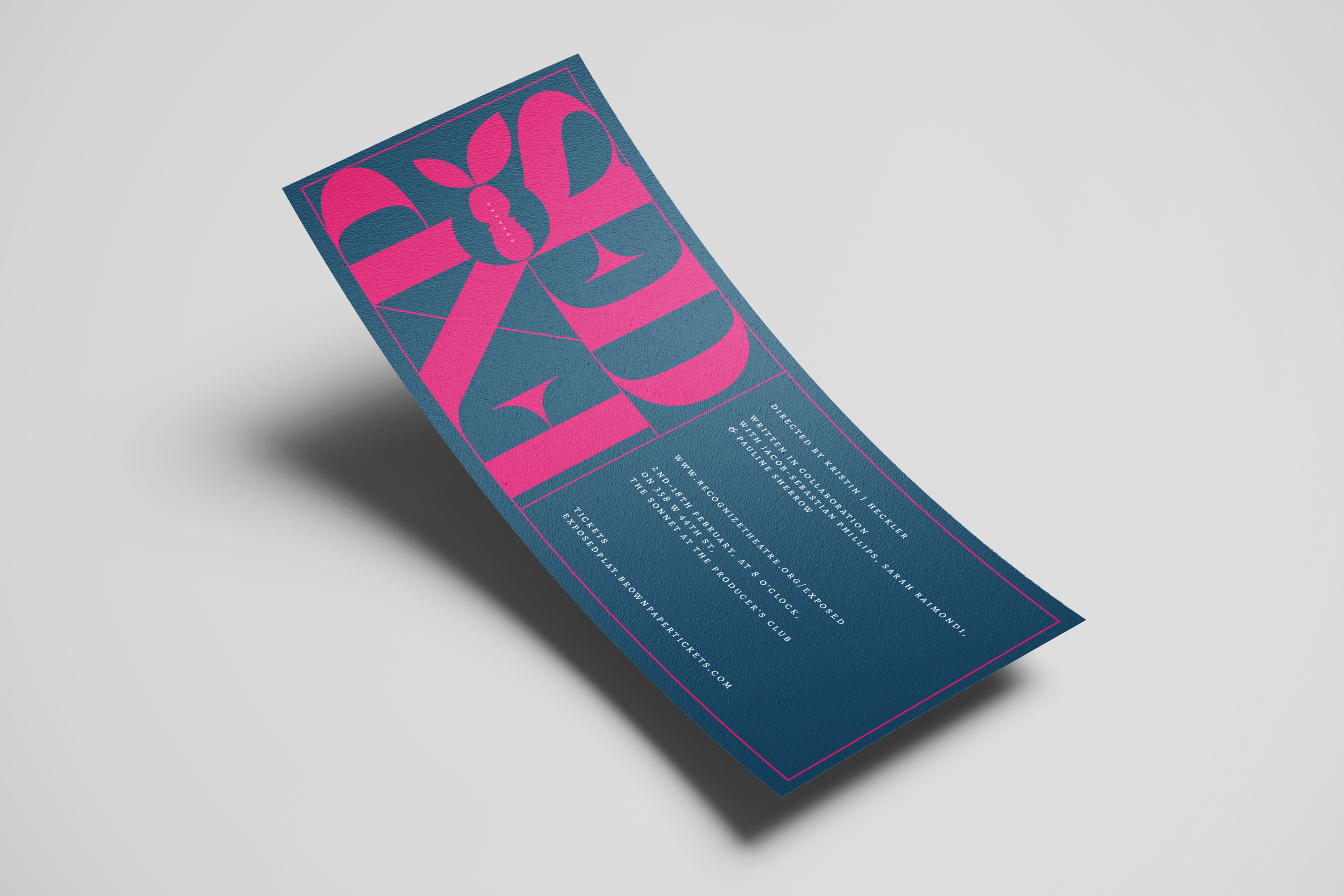
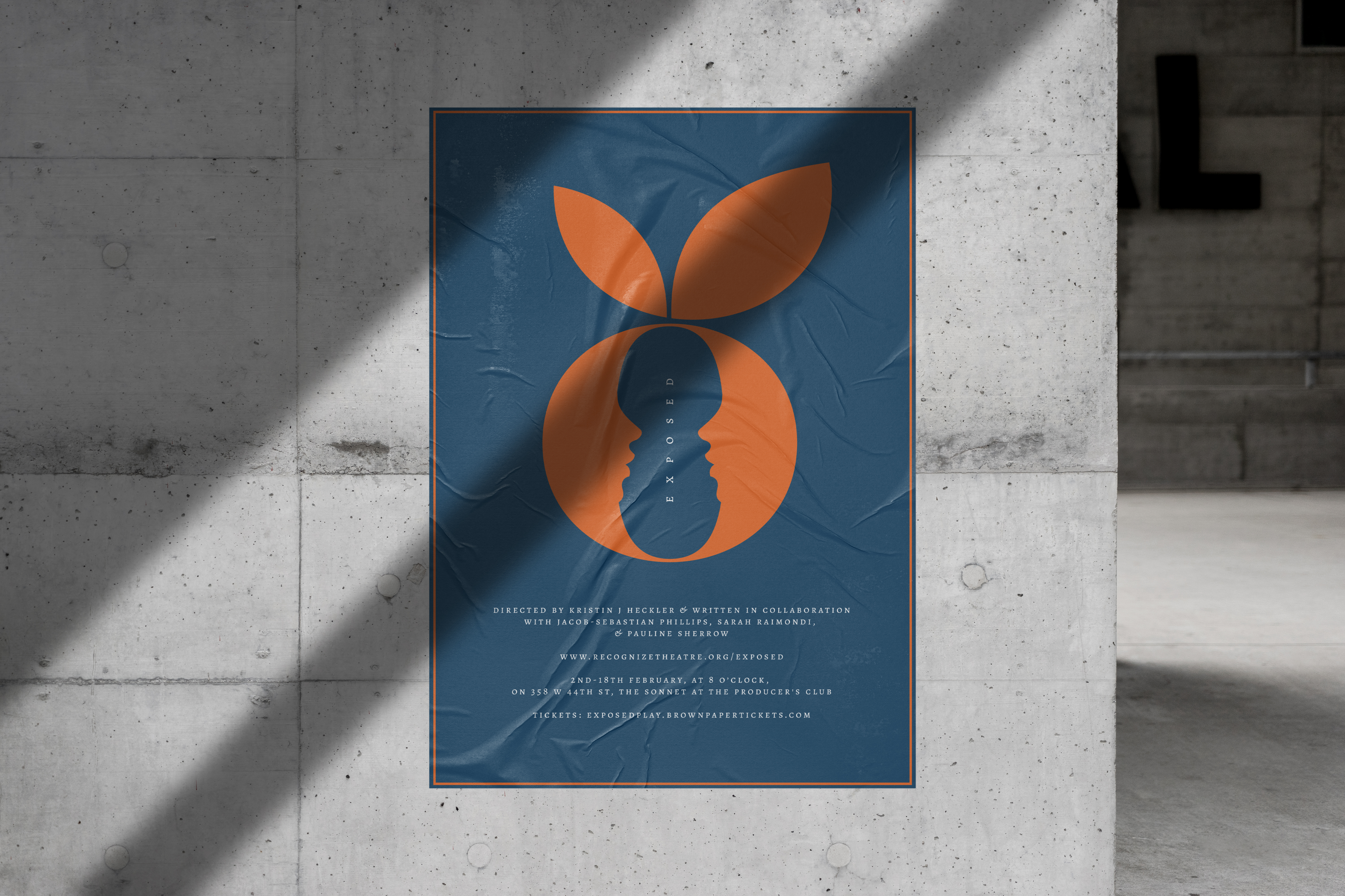
︎︎ Where we were. "Exposed," a provocative new play exploring themes of sexual freedom, societal judgment, and personal autonomy, needed an identity that could communicate its complex themes while attracting the right audience. The challenge was to create visuals that could handle sensitive subject matter with sophistication and intrigue.
︎Where we wanted to be.The play needed an identity that would capture its central tensions—between public and private, judgment and understanding, ownership and spectatorship—while remaining compelling and memorable for New York's discerning theater audience.
Theater Identity Design / Visual Communication / Art Direction
New York City, NY
︎︎ Where we were. "Exposed," a provocative new play exploring themes of sexual freedom, societal judgment, and personal autonomy, needed an identity that could communicate its complex themes while attracting the right audience. The challenge was to create visuals that could handle sensitive subject matter with sophistication and intrigue.
︎Where we wanted to be.The play needed an identity that would capture its central tensions—between public and private, judgment and understanding, ownership and spectatorship—while remaining compelling and memorable for New York's discerning theater audience.
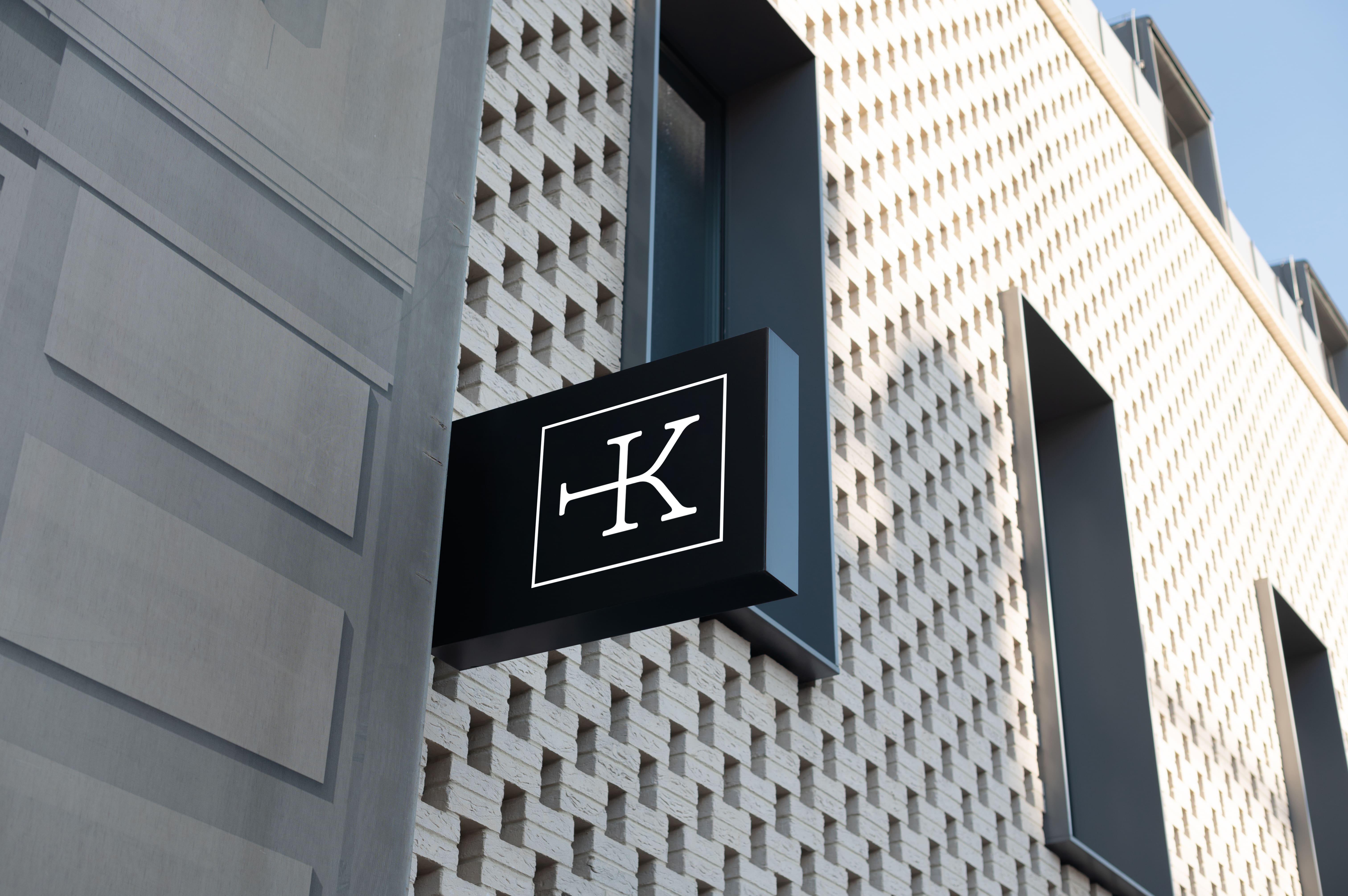
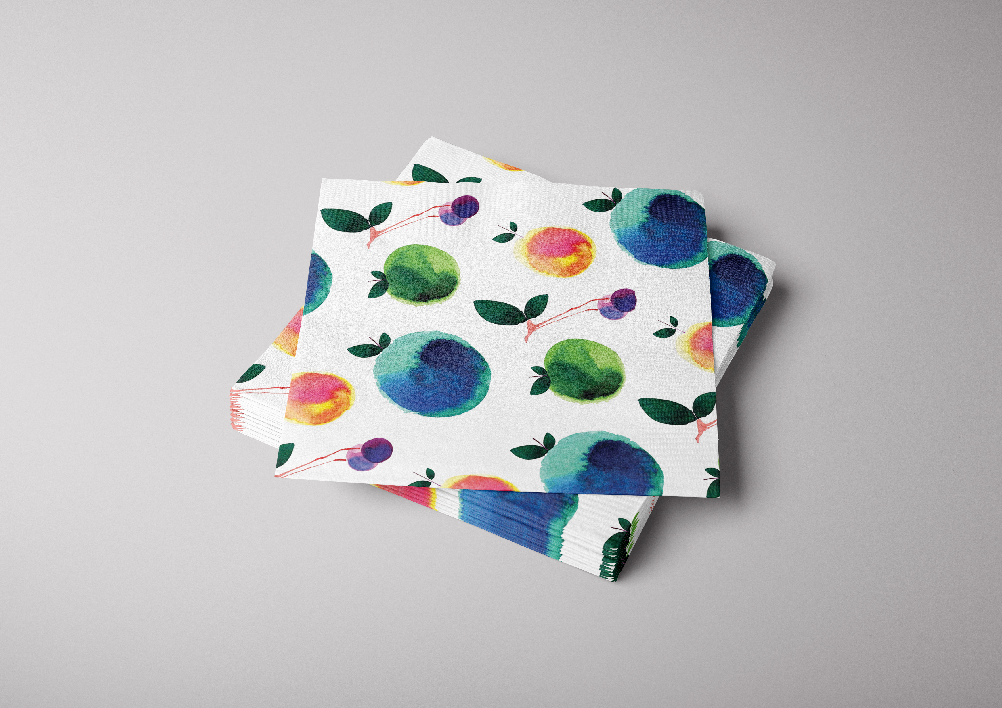
︎ How we got there. We developed a visual identity centered on the duality inherent in the play's themes. Drawing inspiration from the metaphor of forbidden fruit and the concept of facing truths, we created a sophisticated mark that merged two opposing faces, using negative space to suggest the complexities that often get overlooked in such discussions.
The resulting identity system served as both an intriguing visual signifier and a conversation starter, attracting audiences while subtly reinforcing the play's deeper themes about spectatorship, autonomy, and societal judgment in 21st century America.
The visual language successfully walked the line between provocation and sophistication, creating memorable imagery that lingered in viewers' minds long after the curtain fell, much like the play's challenging questions about freedom and consequences.

Ready to transform your business? Let’s connect today so we can get started.